iPhone Simulator Online: Preview iOS in Your Browser
You don't need a MacBook, Xcode, or a $999 spare phone to see how your site looks on iOS. An iPhone simulator can run right inside the browser you already have open — in about fifteen seconds.
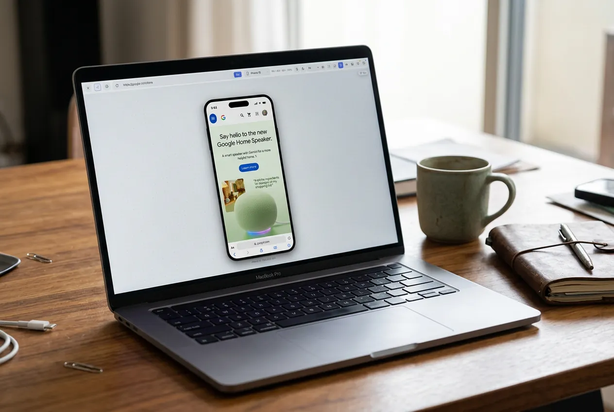
Try an iPhone preview right here
Paste any web address, pick a model, and see it at a true iPhone viewport width — no install needed to look around.
Nothing showing? Plenty of sites — banks, Google, most logged-in dashboards — refuse to be embedded in another page. The extension has no such limit because it frames your own tab. Open this page in a tab
Let's be blunt about what people mean when they search for an "iPhone simulator online". Most of the time it's not an iOS developer looking to sideload an .ipa file. It's a web designer, a marketer, or a freelancer who needs to know whether their landing page looks right on an iPhone before hitting publish. This guide is for them.
Quick answer
The fastest iPhone simulator for websites is a browser extension. Install MobileReady, click the icon, choose an iPhone model, and your current tab renders inside a realistic iPhone frame at the correct viewport width — on Windows, macOS, or Linux. No Xcode, no cloud queue, no account.
The three kinds of iPhone simulator
1. Apple's iOS Simulator (from Xcode)
The real deal — runs iOS in a virtual machine on macOS, including Safari, the home screen and settings. It's what iOS app developers use before pushing to TestFlight.
Downsides: Mac-only, a 7 GB+ Xcode download, slow to boot, and total overkill if you only want to look at a webpage. Safari inside the simulator also behaves subtly differently from Safari on a real iPhone. Great for app developers, wrong tool for everyone else.
2. Online iPhone emulators (Appetize.io and friends)
Cloud services stream a real iOS simulator into your browser tab. It genuinely works, but sessions are laggy, free tiers cap you at a few minutes, and you have to paste your URL in every time. Fine for a one-off check, painful for daily work.
3. Browser extensions that simulate iPhone rendering
This is what most people actually want. A tool like MobileReady installs into Chrome, Firefox or Microsoft Edge and wraps any tab in an iPhone frame — Dynamic Island, correct viewport width, realistic status bar, touch-style scrolling. Safari support is coming soon. It isn't booting iOS in a VM, but for previewing web pages it doesn't need to: the rendering happens in your browser and the frame plus viewport make it behave like an iPhone.
How to simulate an iPhone on Windows or a PC
This is the most common blocker, and the answer is simple: because the extension approach runs inside your desktop browser, the operating system underneath doesn't matter. A Windows 11 laptop, a Chromebook or a Linux desktop all get the same iPhone frames a Mac does. Apple's own simulator is the only option that requires macOS.
- Install a mobile simulator extension in Chrome, Edge or Firefox.
- Open your site in a new tab.
- Click the extension icon.
- Pick "iPhone 15 Pro" — or whichever model your audience actually carries.
- Scroll, tap the CTA, fill out a form. Look at the real thing.
That's roughly fifteen seconds from "I need to check this" to actually checking it. If you also need Android, the same panel holds Pixel and Galaxy frames — see our mobile emulator comparison.
Is a browser-based iPhone simulator accurate?
For the vast majority of websites, the difference between "Safari on iOS" and a desktop browser at an iPhone viewport is nothing you can see. Both respect the same viewport meta tag, both wrap text at the same width, both apply the same CSS box model. The visual layout is identical.
Where they differ is edge cases: -webkit- prefixes, iOS Safari's 100vh weirdness, Apple Pay, some scroll and sticky-header behaviors. If your site leans on those, you'll eventually want a real iPhone or the full iOS Simulator. For a marketing site, a portfolio, or a SaaS dashboard, the extension gets you 98% of the way there in one click.
Which iPhone models should you test?
- iPhone 15 / 15 Pro (393×852) — today's mainstream width.
- iPhone 14 Pro Max (430×932) — the widest common iPhone.
- iPhone SE (375×667) — the narrow, short screen that breaks layouts first. If your page survives here, it survives everywhere.
- iPad Air (820×1180) — the in-between size most sites forget.
Testing the narrowest and widest device in your range catches nearly every responsive bug worth catching.
When you still need a real iPhone
Simulators are for design and layout. Physical devices are for:
- Touch feel — how buttons respond to a fingertip, not a mouse click.
- iOS Safari quirks — sticky headers, viewport height, address-bar hide/show.
- Font rendering — iOS smooths type differently than any desktop browser.
- Performance — a three-year-old iPhone SE is not your M3 MacBook.
- Anything talking to iOS itself — Apple Pay, Add to Home Screen, push notifications.
If none of those apply to your project, a browser-based iPhone simulator is genuinely all you need. Stop feeling guilty about not owning every device Apple has ever shipped.
Viewport simulation does not replace final testing on physical devices or in Safari/WebKit.
Common questions
Is there a free iPhone simulator online?
Yes. MobileReady's free tier covers the core iPhone, iPad and Android frames with no account and no card. Cloud emulators like Appetize also have free session minutes, and Apple's iOS Simulator is free with Xcode on a Mac.
Can I run an iPhone simulator without a Mac?
For websites, yes — a browser extension or a cloud emulator both work on Windows and Linux. For testing native iOS apps, you still need macOS or a paid cloud device farm.
How is this different from Chrome DevTools device mode?
DevTools resizes the viewport but shows no device frame, no realistic status bar, and no quick model switching for client demos. We wrote a full MobileReady vs Chrome DevTools comparison if you want the details.
Can I test a page running on localhost?
Yes — the extension simulates the tab you're already on, including localhost:3000. For checking a dev server on an actual handset, see how to test localhost on a real mobile device.
The bigger picture
The web has been mobile-first for years. Being able to preview any page on any phone in one click isn't a nice-to-have anymore — it's table stakes. Whether you get there with MobileReady, DevTools, or a shelf of test devices, the important thing is that you're actually looking. Ship less code that only ever got tested on the monitor you built it on.
Skip the setup. Just install MobileReady.
Turn any browser tab into a real iPhone, Pixel, iPad, or Galaxy in one click. Free to install, no card required.