A complete toolkit for responsive design, capture and demos.
MobileReady packs everything you'd otherwise stitch together from DevTools, screenshot apps and design pickers — into one quiet browser button.
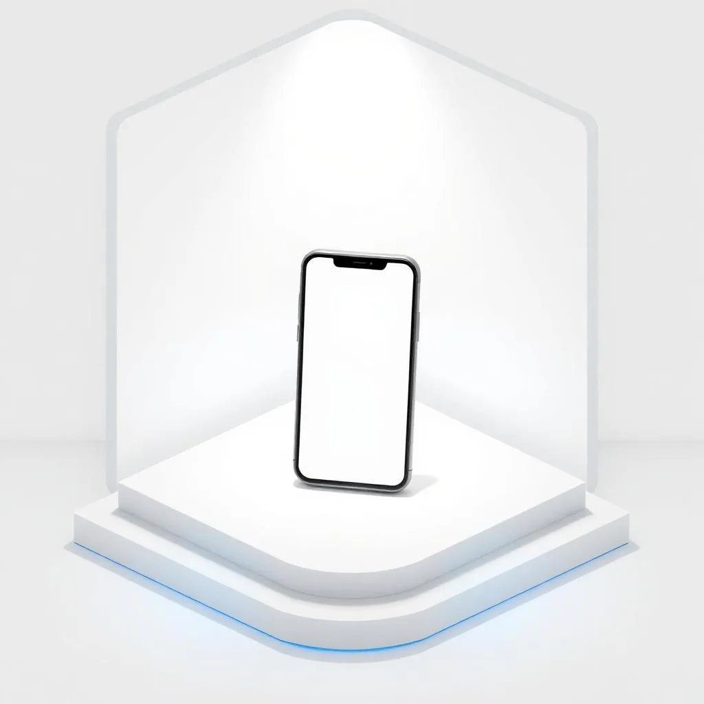
Simulation

One-click device switch
Snap any tab into a device frame instantly.

55+ latest devices
iPhone, Pixel, Galaxy, OnePlus and more, kept current.

Tablets & foldables
iPad, Surface, Galaxy Fold — portrait or landscape.

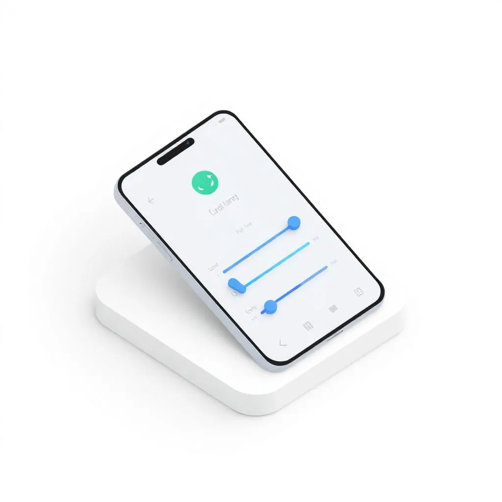
Touch & gestures
Tap, swipe and pinch like a real device.
Capture

HD screenshots
Export crisp, high-resolution PNGs with device frames — perfect for decks and emails.

Scrollshots
Capture entire pages, not just the viewport.

Screenshot annotation tool
Mark up captures with arrows, text and shapes before sharing.
Design tools
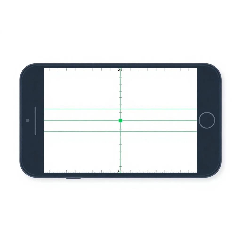
Alignment rulers
Drag unlimited vertical and horizontal guide lines from static rulers on every plan.
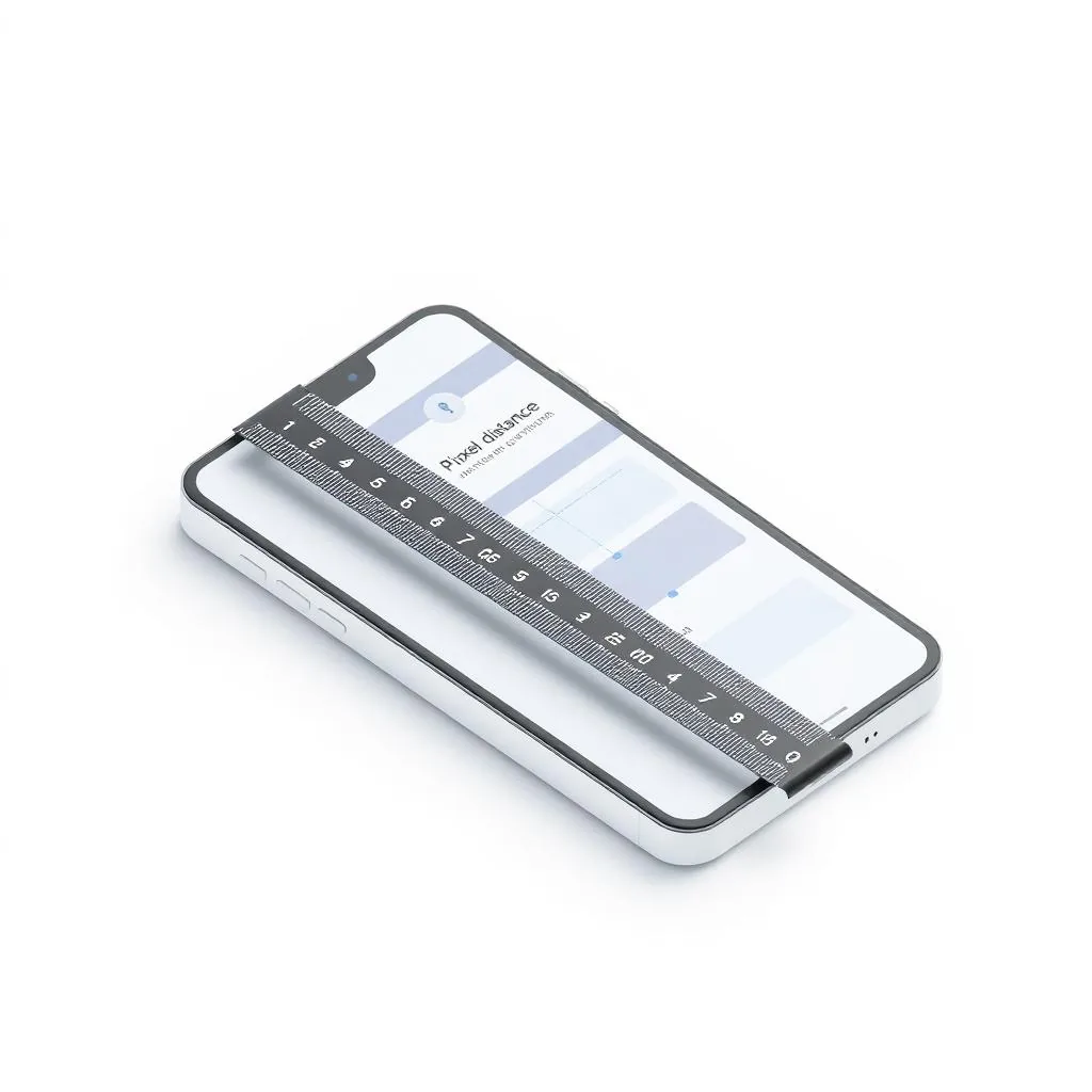
Ruler measurements
Expert plan adds pixel distance readouts between any two guides for precision layout work.
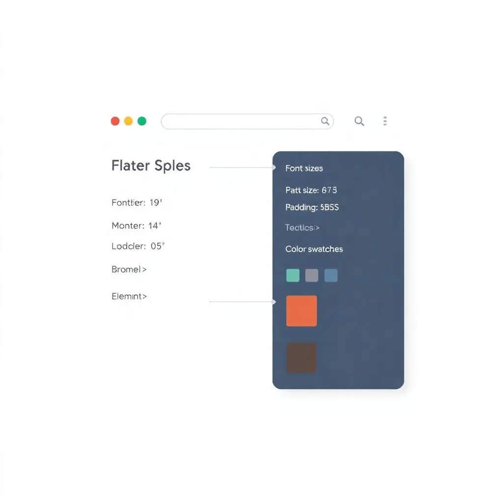
Webpage element specs
Reveal font size, padding, margins and colors of any element — similar to CSS Peeper.
Element inspector & highlight
Hover to highlight any element on the page and drill into its structure.
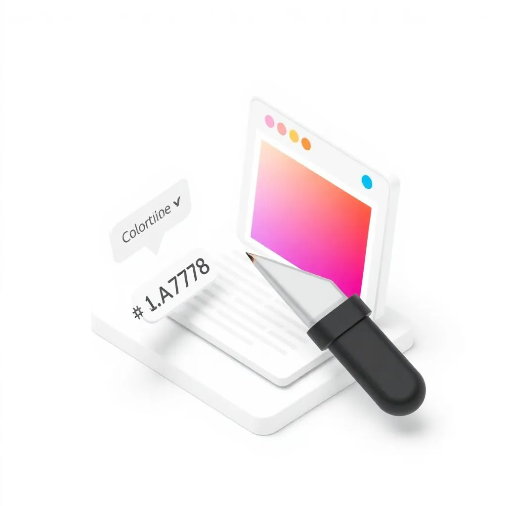
Color hex copy & identify
Pick any color on the page and copy its hex value in one click.
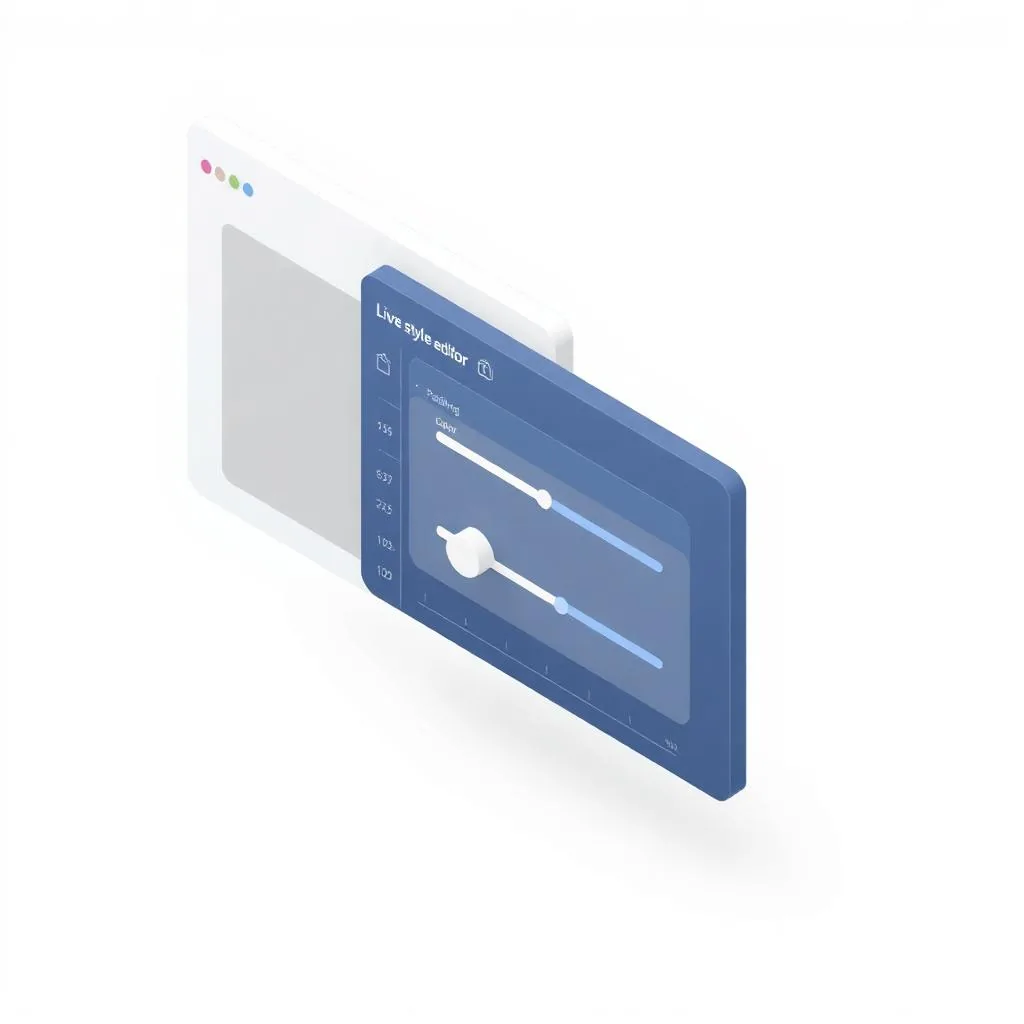
Live styling editor
Edit CSS values in a side panel and watch the page update in real time.
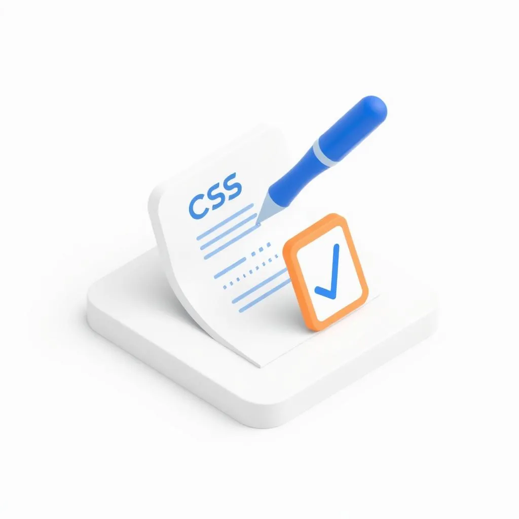
Styling to clipboard
Copy the styles you tweaked straight to your clipboard, ready to paste into your code.
Settings & modes
Display settings
Customize the battery, URL bar, device buttons and other on-screen chrome.
Presentation mode
Hide the device menu and surrounding buttons for spotless client demos.
Collaborate

Share links
Send live previews to teammates and clients.

Works on any site
Local, staging, production — your stack, your URL.

Presets & favorites
Save device combos for repeat client demos.
Team seats
Up to 5 team members on the Expert plan with priority 24-hour support.